come
to
mama
A stellar product with winning taste, Mad Lilly couldn’t rely on quality alone. We needed to find the heart - and story - among the noisy crowd of well-funded low-dose, cannabis-infused drinks in California.

problem
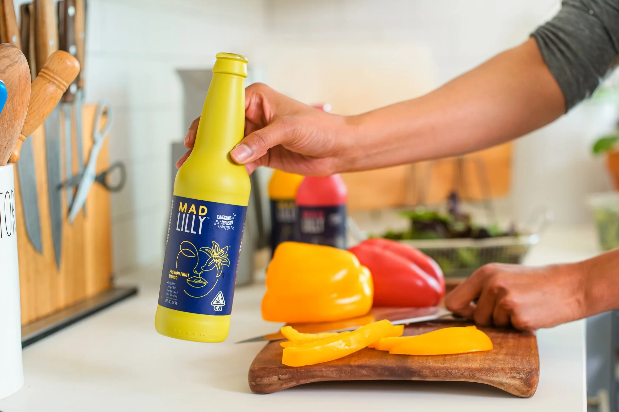
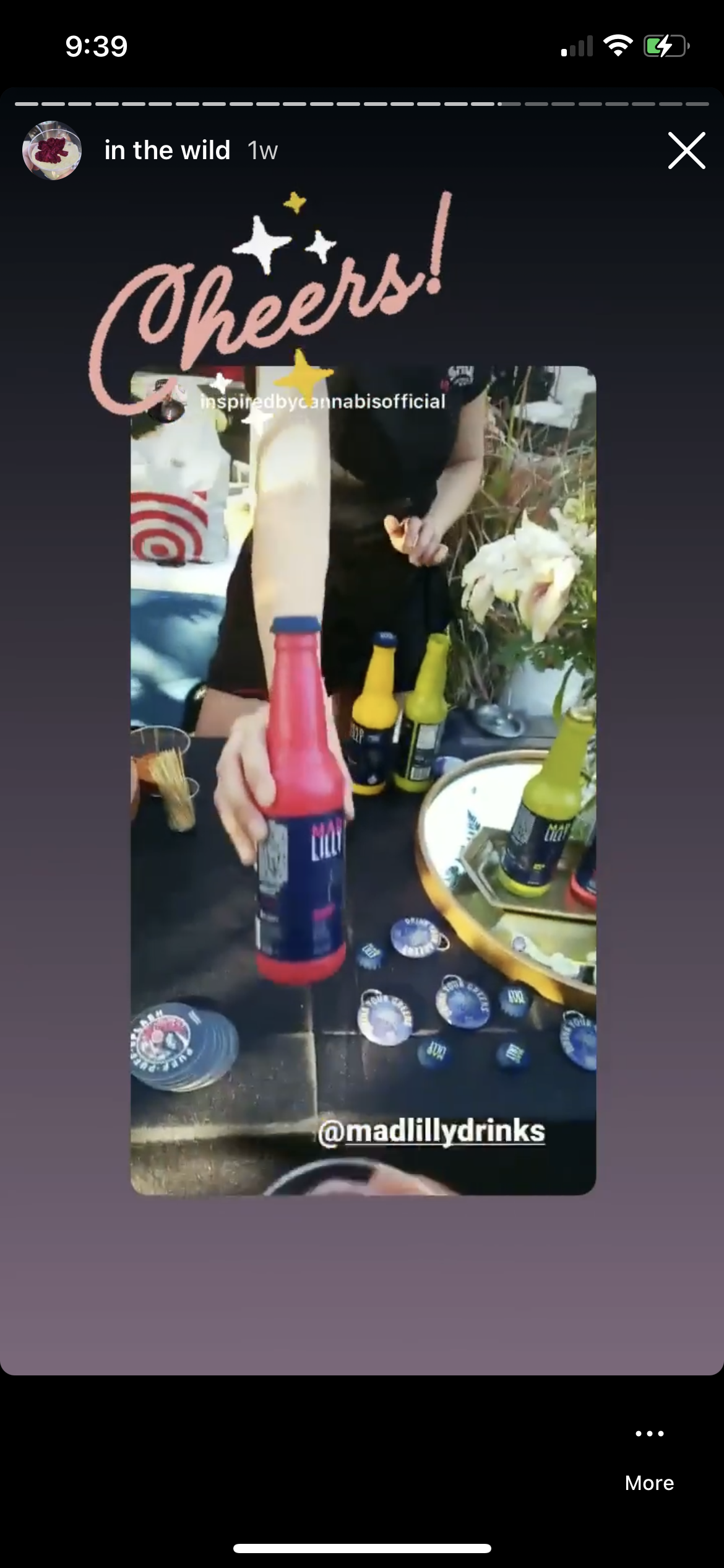
Made with utmost attention to quality and style, Mad Lilly Drinks shine for their fruit-forward flavors and wildly tasteful effects dosed for even the most beginner cannabis consumer. But with at least five close Californian competitors in the RTD low-dose drink category, Mad Lilly came in at a higher price point (and a heavier bottle) than most buyers wanted to deal with. The challenge was to entice dispensary buyers, and eventually consumers, to engage and enjoy what began as just another cookie-cutter CPG brand.
solution
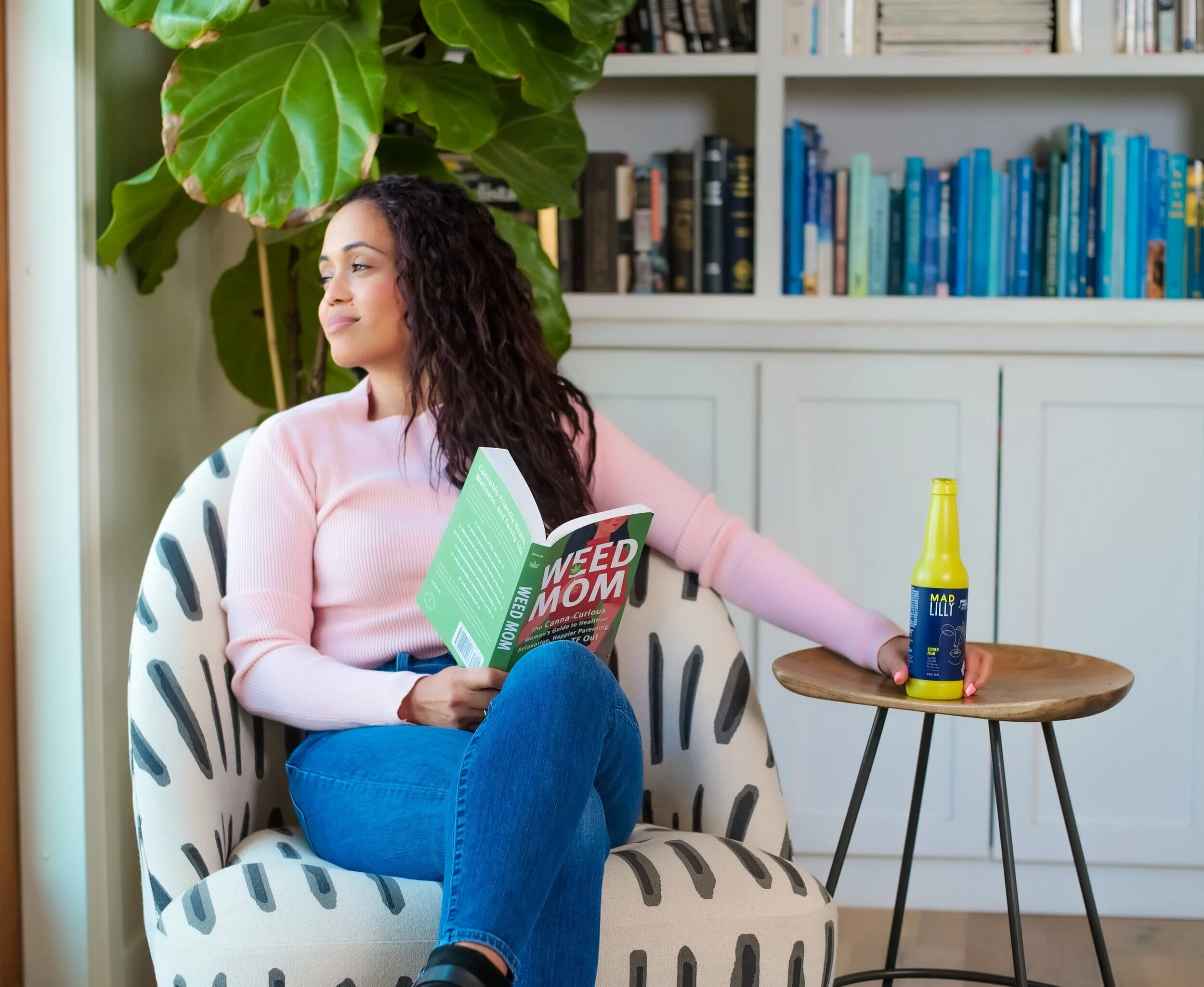
For Mad Lilly, it meant uncovering the magic and stripping away the product benefits to find our founder and CEO, an Asian-American mother and ex-NBA dancer at the center of it all. Judy Yee crafted Mad Lilly as a healthy, delicious drink with just the right amount of cannabis to feel relaxed but still in control. Her journey mirrors many other women discovering the wellness benefits of the plant. Our focus became connecting with California moms by creating a community and becoming a relatable source for content surrounding cannabis and motherhood.
branding


sales


education


moms for mary
Moms For Mary was created to be a community of moms sharing their stories and experiences with cannabis.


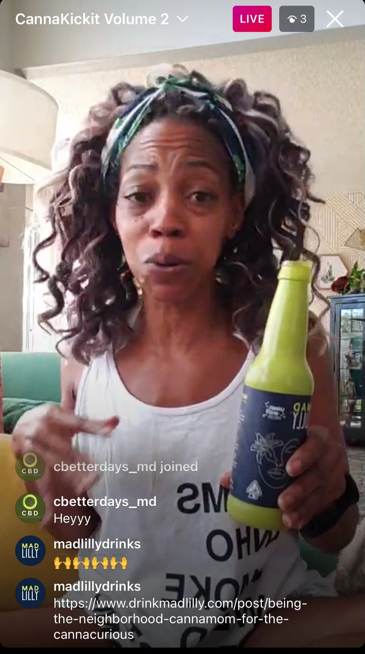
media coverage
Within my time as marketing manager, the campaign built a community of 30+ California-based moms who contributed blog and social media content, garnering attention from buyers as well as national media outlets.


community


Merchandise was centered around what a Mad Lilly mom would want to wear and use.
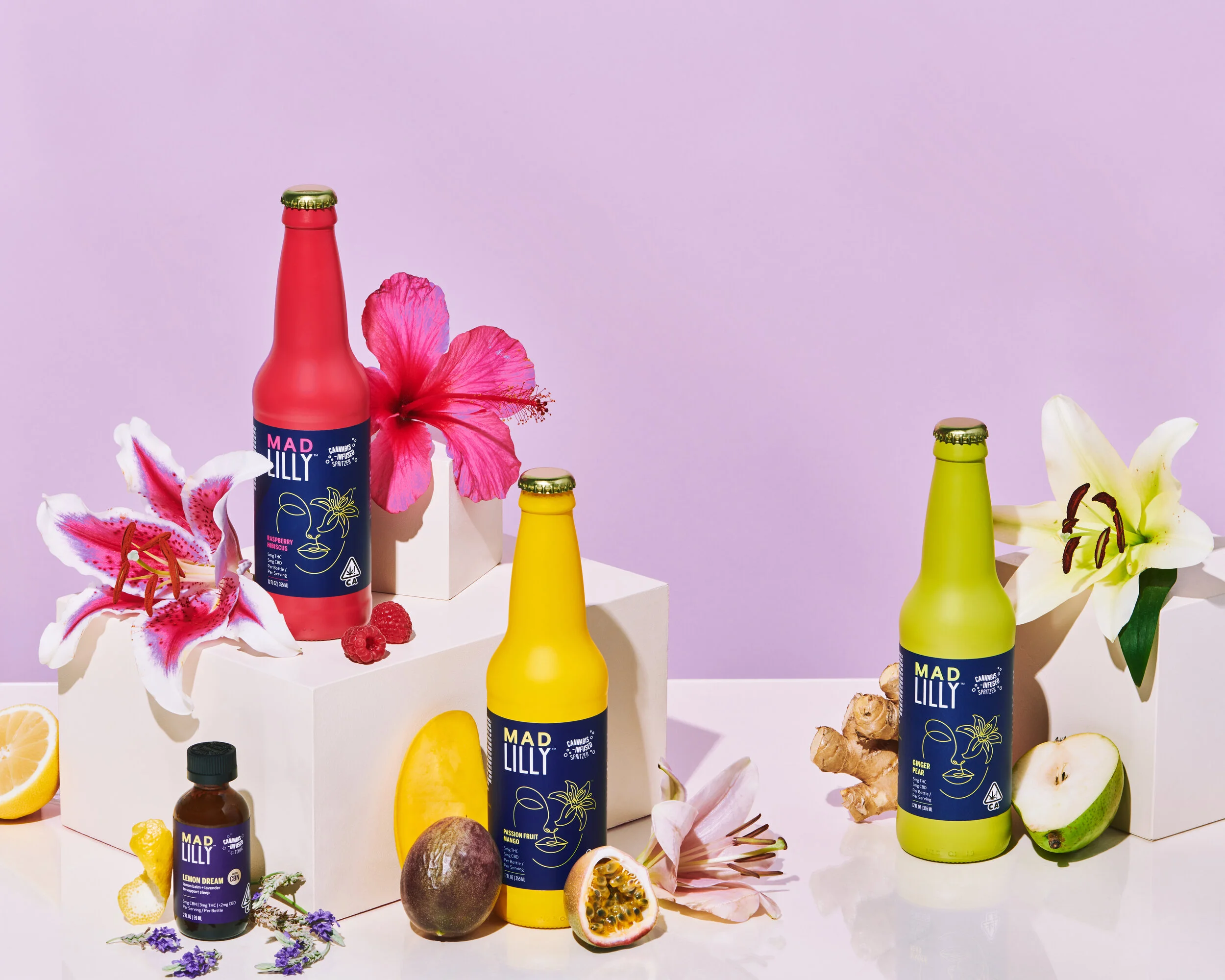
packaging

Initial designs were created by our AOR, but I was involved in editing every element including lockups, copywriting, compliance, logo placement, and spot colors.


With my direction, we created the 8oz Mad Lilly Lemon Dream Tonic label and it’s outer box. The challenge was to create a more medicinal, premium experience while still staying true to the Mad Lilly brand.
My favorite element became the simple gold trim around the top and bottom of the bottle label.